
 03-10-2005, 01:08 AM
|
#61 |

Join Date: Jan 2005
Posts Rated Helpful 0 Times
|
Nice one Oinker
|

|

|
|
03-10-2005, 01:32 AM
|
#62 | |

Join Date: Jan 2005
Location: Australia
Posts Rated Helpful 0 Times
|
Quote:
|
|
|
|
|
|
03-10-2005, 11:19 AM
|
#63 |
![o_anthraxium[wu]'s Avatar](image.php?s=78da8e4da7bac4b32e8f13ba224eca58&u=156&dateline=2006)
Join Date: Jan 2005
Location: California
Posts Rated Helpful 0 Times
|
I like Delux's as well
i kinda messed a bit with cudweiser's logo and i remember seeing another post with the FF symbol being something like infinity ... edited cudwiser's scaling all parts of each "F"    font can change colors can change, and I know the infinity isnt smooth -- a direct result of it being 3 am and me being tired -- I was also thinking of maybe thinning the infinity symbol and maybe making it more of two ovals instead of circles (ie. horizontally stretched) Anyone can feel free to rip these and edit them ... I also have the psd file if it helps -- pm me |
|
|
|
|
03-10-2005, 01:19 PM
|
#64 |
|
Join Date: Dec 2004
Posts Rated Helpful 0 Times
|
Thx valk & Anthraxium[WU]. I just realised that using the conc gren with the pyro is kind of abit odd. Guess I need to wait till the pyro gren2 and flame thrower models are done.
:S |
|
|
|
|
03-10-2005, 02:00 PM
|
#65 |

Join Date: Feb 2005
Posts Rated Helpful 0 Times
|
I posted these in another thread some time ago:
  based on Repair Man's logo: the f should stand out more tho ;D |
|
|
|
|
03-10-2005, 03:37 PM
|
#66 |
|
Join Date: Feb 2005
Location: Ohio
Posts Rated Helpful 0 Times
|
That's sweet Nar. Anthraxium's is a pretty sweet idea too imho.
|
|
|
|
|
03-10-2005, 03:50 PM
|
#67 |

Join Date: Feb 2005
Location: kidderminster, uk
Posts Rated Helpful 0 Times
|
 i got bored 8[ |
|
|
|
|
03-10-2005, 04:03 PM
|
#68 |
|
Join Date: Jan 2005
Posts Rated Helpful 0 Times
|
nice and simpel
i like it ^^ |
|
|
|
|
03-10-2005, 04:31 PM
|
#69 |

Join Date: Jan 2005
Location: Kyoto, Japan
Posts Rated Helpful 0 Times
|
Nice thread, folks.
|
|
|
|
|
03-10-2005, 04:48 PM
|
#70 |
|
Join Date: Jan 2005
Location: Pennsylvania
Posts Rated Helpful 0 Times
|
I like anthraxiums last layout a lot. It has perfect flow. Throw some random 3-d effects in there for a boyish grin.
|
|
|
|
|
03-10-2005, 05:56 PM
|
#71 |

Join Date: Dec 2004
Location: SCOTLAND (above England)
Posts Rated Helpful 0 Times
|
I think you have hit the nail on the head in terms of logo shape nar, dump the old style textures though!
|
|
|
|
|
03-10-2005, 06:33 PM
|
#72 |
|
Join Date: Mar 2005
Posts Rated Helpful 0 Times
|
id have to agree that there is lots of (backwards F) F logo's for other games. but these logos are interesting. keeep it up
|
|
|
|
|
03-10-2005, 07:05 PM
|
#73 |

Join Date: Mar 2005
Location: Sweden, European Union
Posts Rated Helpful 0 Times
|
Now this is the one I like. It's plain, yet delicous, like logos are supposed to look. (and it's easy to make and render in 3D It just needs more colors... coz it's too grey atm Just ONE LAST thing. Is this thing free to work with? I would like to give it a try and make a logo. /Spader |
|
|
|
|
03-10-2005, 07:46 PM
|
#74 |
|
Join Date: Jan 2005
Posts Rated Helpful 0 Times
|
The infinity sign with the f in the middle is great.
Anyone who isn't a ignorant to the fact that the sideways 8 = infinite, I think would agree. Do one in periwinkle and gray |
|
|
|
|
03-10-2005, 09:30 PM
|
#75 |
|
Join Date: Jan 2005
Location: California
Posts Rated Helpful 0 Times
|
spader, you can rip that as you see fit. Im interested to see what you can come up with
Have some fun with it and post what you come up with I also have the .psd file if you want it, pm me. btw, i used grey cuz i was going to keep it grayscale. Then i added the red trim ... anyways, i would never leave it all grey like it is now, I was just really tired from it being 3 am. The font is also the infamous Sydnie font which i d/led |
|
|
|
|
03-10-2005, 09:32 PM
|
#76 |

Join Date: Mar 2005
Location: LBKTX
Posts Rated Helpful 0 Times
|
I like anthraxium's version the best....it hits on 3 different levels
Take the ff from the original quake TF logo, has the TFC and TF2 circle logos, and it introduces the infinity design, meaning Fortress "Forever" Its perfect, but it could use some eye candy. |
|
|
|
|
03-10-2005, 09:53 PM
|
#77 |
|
Join Date: Dec 2004
Location: SCOTLAND (above England)
Posts Rated Helpful 0 Times
|
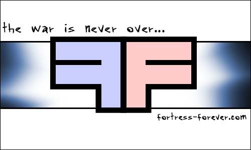
I dont like the back to back F's at all, particularly because it has been done before in other FPS games
|
|
|
|
|
03-10-2005, 09:56 PM
|
#78 |
|
Join Date: Jan 2005
Location: California
Posts Rated Helpful 0 Times
|
btw, thank you to
SoulCutter Binary Life Spader cudweiser I appreciate the positive comments |
|
|
|
|
03-10-2005, 10:05 PM
|
#79 |
|
Join Date: Mar 2005
Location: LBKTX
Posts Rated Helpful 0 Times
|
 well i don't like you storm, particularly because you've been used by everyone else in the forum... |
|
|
|
|
03-10-2005, 10:08 PM
|
#80 |
|
Join Date: Jan 2005
Location: California
Posts Rated Helpful 0 Times
|
I would suggest 2 things:
first: make sure the infinity isnt wider than the two F's let make em pretty equal in size (otherwise it looks strange) second: cant we cut that pic down to size :P look @ all the white :P |
|
|
|
 |
| Currently Active Users Viewing This Thread: 1 (0 members and 1 guests) | |
|
|


 Linear Mode

