|
|
#121 |
|
Gets tickled by FF
Fortress Forever Staff
Join Date: Jun 2007
Location: UK
Class/Position: Med Solly HW Gametype: Any/CTF Posts Rated Helpful 41 Times
|
lol.. that is indeed rather funny and yes I did have a lot of it done around 2.4's release. But I never made any promices about it's release (till now). Quote me -> It'll be in 2.5
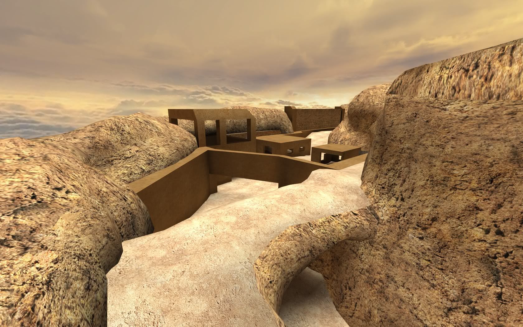
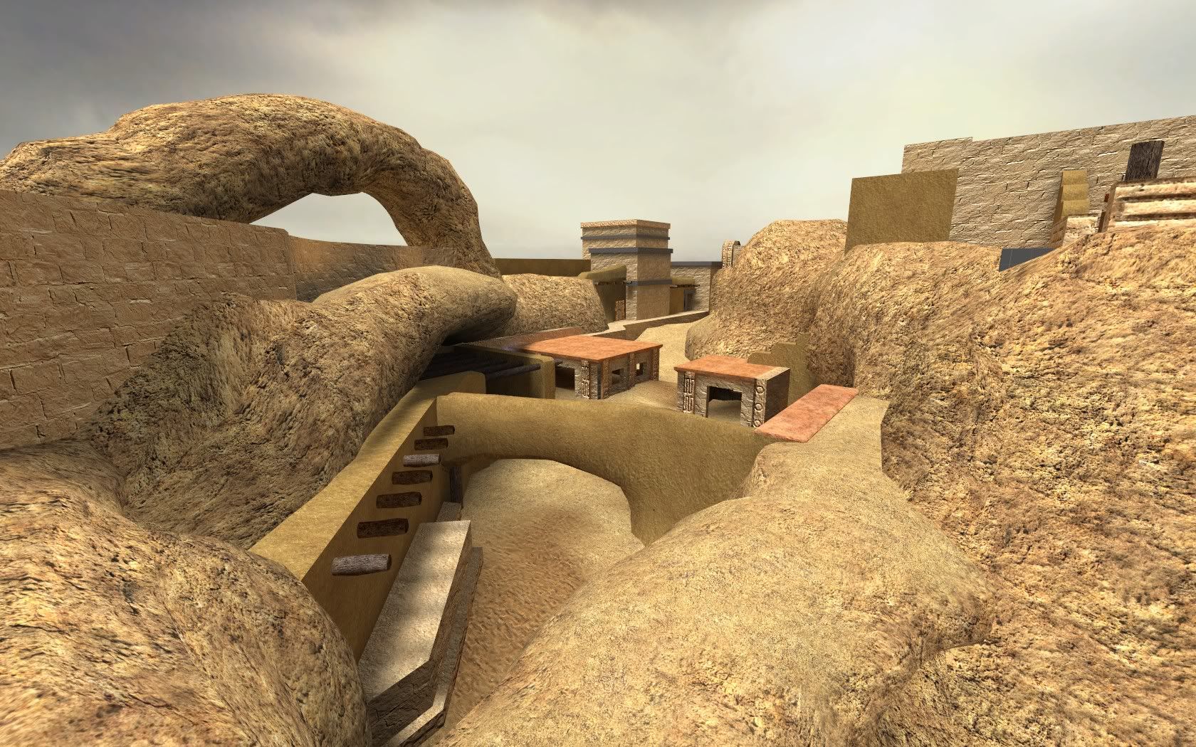
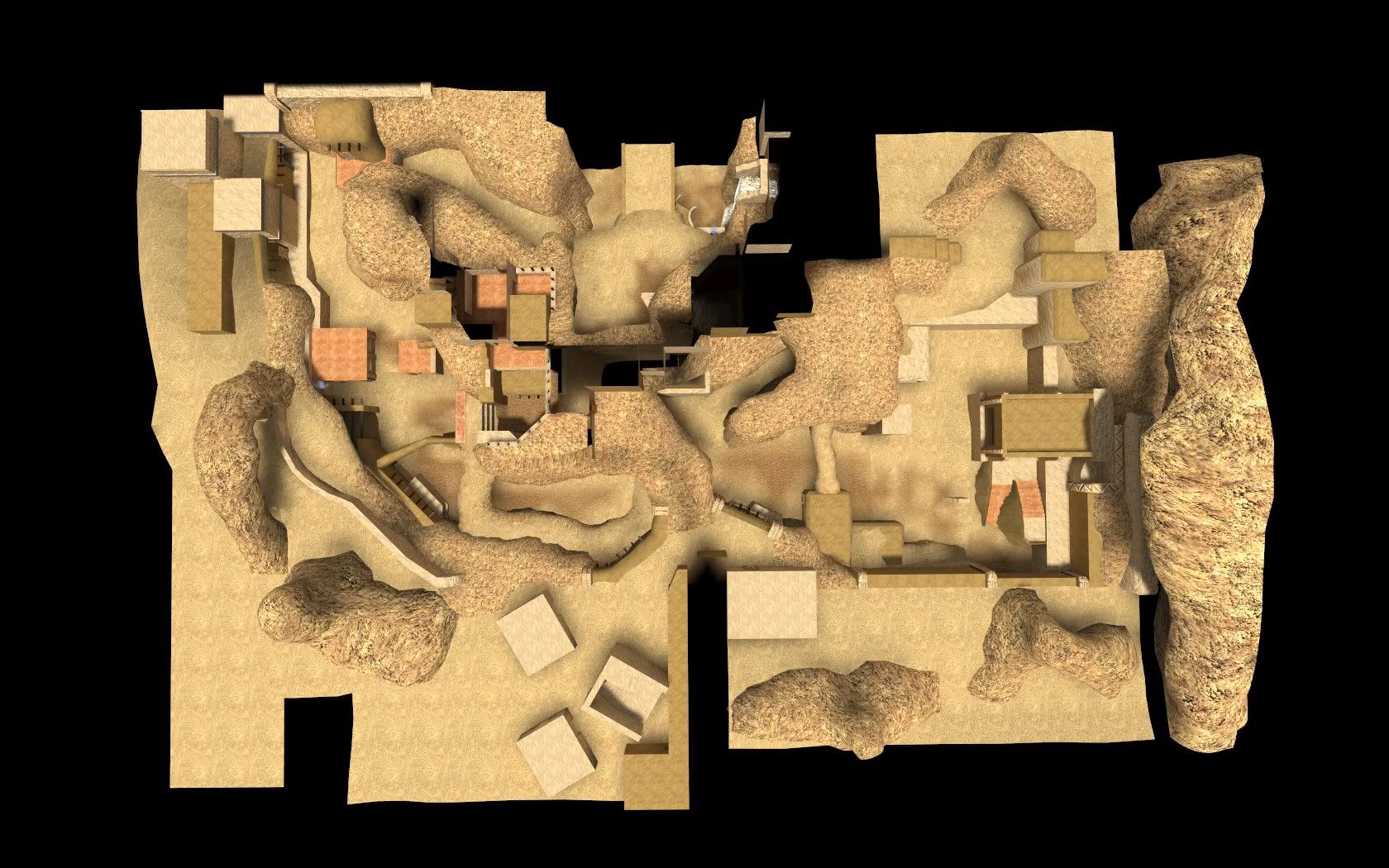
I was gonna make a jornal for those who dont go on FF forums to see something being done.. and I still might. but just for you guys I'll put a few pics here. It works really well, fps is good and seems pretty balanced with even teams. Needs a bit more work for the release but I'll have loads of time for that stuff within a week's time.     
|
|
|

|
|
|
#122 |
|
WhenNailGrenWillOut?
Beta Tester
Join Date: May 2009
Gametype: mp_prematch Affiliations: [:)] - Frag Happy, babe| Posts Rated Helpful 29 Times
|
Elmo I love you D: D: D:
no homo but damn those screenies are hot.
__________________
[[ ff_hotfudge - bhop_theonlyone ]] "As the the new year approaches I await for it like an case of explosive fecalomania otherwise know as diareha or the massive shits. I am gripping the sides of the toilet as my stomach produces the first hollow thud out of the anus of the year to come." DarkeN_HellspawN Last edited by moosh; 04-22-2010 at 08:44 PM. |
|
|

|
|
|
#123 |
|
Pew pew ze beams
Join Date: Jan 2008
Gametype: Gathers Affiliations: pew pew Posts Rated Helpful 11 Times
|
yawm i love the looks, clean textures, cool lightning and cool details, not just a port, good job so far.
|
|
|

|
|
|
#124 |
|
D&A Member
Join Date: Oct 2007
Gametype: AvD, I/D, waterpolo, hunted Posts Rated Helpful 6 Times
|
I'll see your screenshots and match you these. Sorry about the huge size, I couldn't figure out how to shrink down the photobucket images in forum code:
circe 2005:      circe 2008:    Personally I prefer the 2008 lighting myself. Any chance of using that light_environment? Last edited by chilledsanity; 04-22-2010 at 09:05 PM. |
|
|

|
|
|
#125 | |
|
Stuff Do-er
Lua Team
Wiki Team Fortress Forever Staff |
Quote:
__________________
#FF.Pickup ¤ Fortress-Forever pickups My Non-official Maps Released FF_DM_Squeek - FF_2Mesa3_Classic - FF_Siege_Classic Beta FF_Myth - FF_Redlight_Greenlight Sick of the people on the internet, always moanin'. They just moan. - Karl Pilkington |
|
|
|

|
|
|
#126 |
|
AKA LittleAndroidMan
D&A Member
Beta Tester Join Date: Sep 2007
Location: Dystopia
Class/Position: Demo/Medic Gametype: CTF Affiliations: [TALOS] [SR] Posts Rated Helpful 11 Times
|
Damn Elmo, that's sexy.
__________________
|
|
|

|
|
|
#127 |
|
D&A Member
Join Date: Oct 2007
Gametype: AvD, I/D, waterpolo, hunted Posts Rated Helpful 6 Times
|
No I mean the orange-ish hue to match the cloudy sky and evening time skybox, it blends well. If you think it looks like fullbright, you're blind. There just aren't that many shadows because of the angle of the shots. More shadows is easy, just change the orientation of the light_environment closer to the horizon.
I mean no offense to Elmo's work, the mapping is great, but the lighting has a slightly intense yellow-greenish hue that looks like a stock value for many HL2 maps paired with a grey cloud overcast skybox texture. It's not as extreme, but this is basically the same mistake the original version of palermo made. It either needs a light_environment change, a skybox change, or a combination of the two. Keep in mind, I understand this is a work in process, just a little concerned about defending this lighting scheme / skybox combo as a final version. |
|
|

|
|
|
#128 |
|
Stuff Do-er
Lua Team
Wiki Team Fortress Forever Staff |
That's fair.
__________________
#FF.Pickup ¤ Fortress-Forever pickups My Non-official Maps Released FF_DM_Squeek - FF_2Mesa3_Classic - FF_Siege_Classic Beta FF_Myth - FF_Redlight_Greenlight Sick of the people on the internet, always moanin'. They just moan. - Karl Pilkington |
|
|

|
|
|
#129 |
|
Gets tickled by FF
Fortress Forever Staff
Join Date: Jun 2007
Location: UK
Class/Position: Med Solly HW Gametype: Any/CTF Posts Rated Helpful 41 Times
|
yeah there's been a few convos about the skybox on the beta forum which I never did get round to doing. I like the look of that colour and skybox so I'll certainly try it if i can find it along with the ideas on the beta forum.
Indeed, although mostly done geometry and core style wise, it is still a work in progress but thanks for the kind words so far ppl |
|
|

|
|
|
#130 |
|
Pew pew ze beams
Join Date: Jan 2008
Gametype: Gathers Affiliations: pew pew Posts Rated Helpful 11 Times
|
for me the light_envoirment looks great judging by the pictures, goes along with the sand and green bits, but ye the old palermo version light_env sucked a bit :P, now its fine.
|
|
|

|
|
|
#131 |
|
D&A Member
Join Date: Oct 2007
Gametype: AvD, I/D, waterpolo, hunted Posts Rated Helpful 6 Times
|
Elmo: Well I can't tell everything from these shots, but I notice the light value is high enough so that you get that slight overbright effect in areas. If you like the skybox, fine, but my point is intense yellow light combined with overcast grey clouds don't really mix.
EDIT: Unless there's an obvious spot where the sun is coming through an opening in the clouds (something I can't tell from the screenshots). zE: Yeah palermo looks fine now, but the original was a nightmare in terms of lighting perspective. It had an intense oversaturated yellow-greenish light combined with a dark greyish blue skybox with the sun smack dab in the middle of a dark nimbus cloud. Not only was it ugly, it was nothing you would ever see naturally occuring either. Last edited by chilledsanity; 04-23-2010 at 12:07 AM. |
|
|

|
|
|
#132 |
|
D&A Member
Wiki Team Fortress Forever Staff Join Date: Apr 2007
Posts Rated Helpful 31 Times
|
Maybe I should leak some new Palermo screenshots, too. I changed the lighting again.
Looking at these screens (and I guess I should look at the map again to verify), I think the ambient level could be darker. Neutral environment lights are always better, especially when your textures have so much of one color. Lights should not have a color, o much as a temperature. I'm not fond of the greenish sand that serves as the path. |
|
|

|
|
|
#133 |
|
Banned
Join Date: Sep 2008
Class/Position: Soldier Gametype: AVD Affiliations: TALOS Posts Rated Helpful 5 Times
|
|
|
|

|
|
|
#134 | |
|
D&A Member
Join Date: Oct 2007
Gametype: AvD, I/D, waterpolo, hunted Posts Rated Helpful 6 Times
|
Quote:
Also I agree, the path is something I missed. The green path is a little counterintuitive because typically you would expect the main path to be the most worn-looking area in the map, not where grass is growing. And I admit this stuff is nitpicky, though lighting can affect the whole mood of a map. Last edited by chilledsanity; 04-23-2010 at 06:20 AM. |
|
|
|

|
|
|
#135 |
|
no war but class war
Fortress Forever Staff
Join Date: Oct 2007
Location: big bad berlin
Class/Position: Soldier / Scout Gametype: ctf Affiliations: [w~k!] Posts Rated Helpful 3 Times
|
yeah, a dev journal would be the way to go imo.. let's get some p.r. out there!
|
|
|

|
|
|
#136 |
|
Gets tickled by FF
Fortress Forever Staff
Join Date: Jun 2007
Location: UK
Class/Position: Med Solly HW Gametype: Any/CTF Posts Rated Helpful 41 Times
|
I'll get some up with my previous & current workings sometime over the weekend.
|
|
|

|
|
|
#137 |
|
Pew pew ze beams
Join Date: Jan 2008
Gametype: Gathers Affiliations: pew pew Posts Rated Helpful 11 Times
|
the greenish sand have a purpose imo, that sand texture is uber reflective, the greenish part is less reflective so you can see your path a bit better.
|
|
|

|
|
|
#138 |
|
Gets tickled by FF
Fortress Forever Staff
Join Date: Jun 2007
Location: UK
Class/Position: Med Solly HW Gametype: Any/CTF Posts Rated Helpful 41 Times
|
The green path will be changed to a brown or grey texture when I get round to making the texture for it.
|
|
|

|
|
|
#139 |
|
D&A Member
Join Date: Sep 2007
Posts Rated Helpful 13 Times
|
That whole mid section around cap 3 looks tiny. It could be just the angle from the pictures but it looks like a solly could do a single rocket jump across the canyon.
Plus now you're letting people cross from up top? Doesn't that sorta defeat the purpose of a bridge when all anyone has to do is take a side route (and just as easy to take), for O and D? In TFC only the concers could take that upper part and not take damage, now any old class can run up there, even build sg's up there. And on defense that was a spot you could get out to get number 3 turn the tides, now any offensive player would have to contest with potentially the entire enemy team going that route, and I see sg's being built there. Not a huge fan of that idea. The only ways across should be the bridge, the tunnel and the ladders out of the pit. |
|
|

|
|
|
#140 |
|
Nade Whore
Server Owner
Beta Tester Join Date: Sep 2007
Location: Oklahoma
Class/Position: Scout/Soldier Gametype: CTF/TDM Affiliations: blunt. Moto Posts Rated Helpful 128 Times
|
Very nice elmo, this was one of my favorites in TFC, and I'm glad this map is coming together well.
|
|
|

|
 |
| Currently Active Users Viewing This Thread: 1 (0 members and 1 guests) | |
|
|