|
|
|
|
#1 |
|
Join Date: Mar 2005
Location: The Peoples Republic of Harmfull Free Radicals
Posts Rated Helpful 0 Times
|
ff_anticitizen (not cacti anymore)
I'm making a dustbowl-ish map.
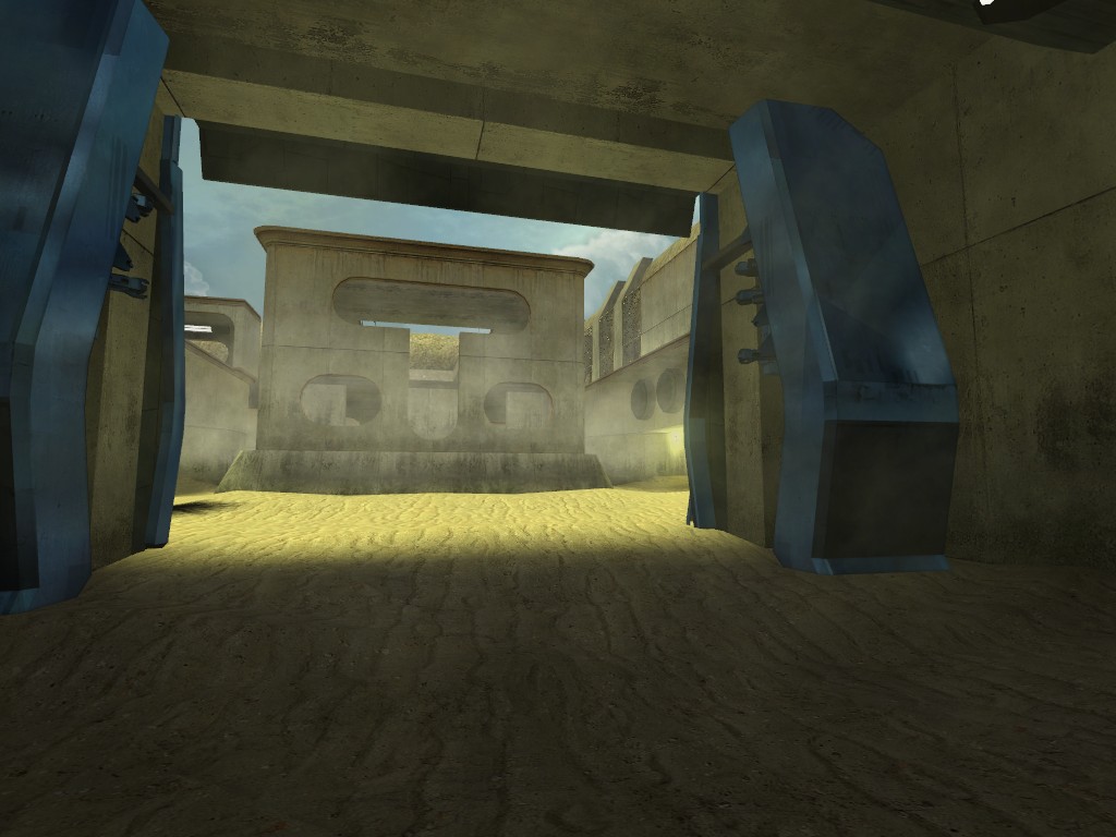
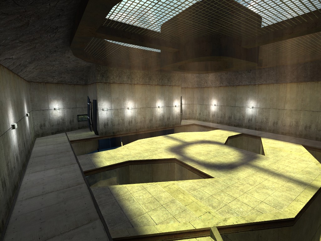
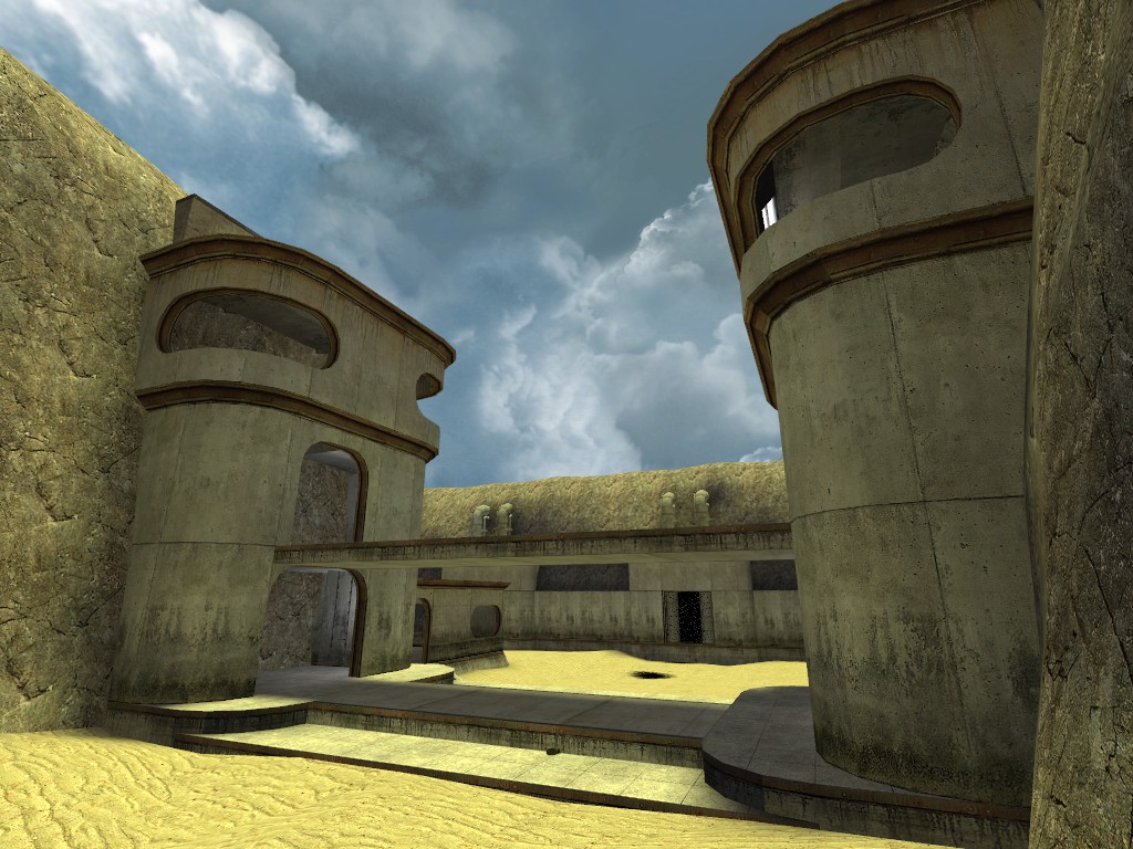
I've got the first stage sort-of done: Here's the doors that open leading to the first area:  Here's the attackers spawn room:  Here's some defensive structures:  The map is of course in 3 stages. The first is this wide open sandy area you see, and it's designed to be a bit easy for the attackers. The second is all inside some sort of giant dessert facility. The thrid area is back outside and will be an uphill battle for the attackers. I know attacking uphill in an AvD map is a recipie for boredom so I'm going to try to balance it out by making the section relitively short and allow the attackers to gain access to grenades relitively easily. The original Dustbowl had problems where too many/too few people would always make the map unbalanced. By making the begining of my map easy and the end hard I'm trying to make it so that there is an apropriate challenge somewhere along the course of the map for a wider variety of team sizes. Hopefully I can do this without making it so that there's no ammount of players that is balanced for the whole map. So, for now, I'm working on the second stage but it's turning out to be a bitch. I'll update as things go on (but I may not get to work on this very often) |
|
|

|
|
|
#2 |
|
Join Date: Dec 2005
Posts Rated Helpful 0 Times
|
Bloody yourself on a cactus tree, wipe it on your dress and send it to MEEEEEE
I think this looks cool! Youve already got quite a good theme going, looking forward to see how this developifies. |
|
|

|
|
|
#3 |
|
Useless
Retired FF Staff
|
Looks sweet. Also: haha, "dessert facility." Skybox doesn't fit. I'm diggin' the windows and T shapes and stuff in the buildings, those're really cool.
__________________
Look at all those dead links. |
|
|

|
|
|
#4 |
|
Join Date: May 2006
Posts Rated Helpful 0 Times
|
Its a very nice job, as the other guy said, great theme all kept relative!.
The defensive area you show(3rd pic), though the windows shape and sizes go with the theme, it looks all abit too easy for grenades to be thrown in without much accuracy then again suppose you counter that with just how many defensive holes there are. Oh yeah, you know the bridge that links the two defensive posts, maybe have abit of a 'front lip' so there is alittle bit of cover, even if its only enough to cover half the height of a engineer or soldier etc, high enough to not be used for a sg but a good spot for dispenser etc. Only really suggesting it as with how open that area is for attackers |
|
|

|
|
|
#5 |
|
Join Date: Jan 2005
Location: Fort Worth, Tejas
Posts Rated Helpful 1 Times
|
Sky box looks good but does not make sense b/c the lightning is too bright
Overall Theme looks good. Like a sort of futuristic arena set in the desert |
|
|

|
|
|
#6 |
|
Join Date: May 2005
Location: Oxford, UK
Posts Rated Helpful 0 Times
|
Looks good. Any chance of a bsp to download please? (not really possible to comment on the design til then).
Last edited by o_caesium; 05-17-2006 at 10:54 AM. |
|
|

|
|
|
#7 |
|
Join Date: Dec 2004
Posts Rated Helpful 0 Times
|
Looks like Tatooine!
|
|
|

|
|
|
#8 |
|
Join Date: Mar 2005
Location: The Peoples Republic of Harmfull Free Radicals
Posts Rated Helpful 0 Times
|
The skybox is just a placeholder for now. I'm assuming we'll get some good sunny skies when FF comes out. In all likelyhood I'll just use whatever sky dustbowl does. I was thinking all the concrete textures on the buildings and stuff would be placeholder too but I think I like them now. All the rock textures and props are placeholders for FF rock textures and props (Again, I'm assuming FF will have good 'dustbowly' rocks and rock/sand textures).
I might also release an early version of this map if I can just get the middle section done. I'm *this* close to scrapping all I have on that section (Which ammounts to one hallway) and starting over. Actually, I'm probably going to just go start the third section which I think will be much more fun to make. |
|
|

|
|
|
#9 | |
|
A Very Sound Guy!
Fortress Forever Staff
Join Date: May 2005
Location: UK
Posts Rated Helpful 15 Times
|
Quote:
the spawn room looks cool too, although i think it would serve as a great flag room! have a room below it also, the guys are right, the light needs to be a bit more neutral, but keep it in the yellows, it compliments the sand well! |
|
|
|

|
|
|
#10 |
|
Fear teh crowbar.
Retired FF Staff
|
Looking good Nez, keep it up. And be sure to post a .bsp for it when you get it done!
|
|
|

|
|
|
#11 |
|
Join Date: Feb 2005
Posts Rated Helpful 0 Times
|
looking great. the rocks aren't good yet, i know it's a wip. insane brushwork you got there.
|
|
|

|
|
|
#12 |
|
Join Date: May 2005
Location: ny
Posts Rated Helpful 0 Times
|
where's the cacti?!
EDIT: i'm actually just kidding, though i do hope you put some in eventually =p looking really good |
|
|

|
|
|
#13 |
|
Retired FF Staff
Join Date: Dec 2004
Location: cow college
Posts Rated Helpful 13 Times
|
I'm not comitting to this, but I will flirt around w/ creating a more...sunny.. skybox since I learned how to do all the crap involved in making one.
|
|
|

|
|
|
#14 |
|
Join Date: Jul 2006
Location: Valencia, California
Posts Rated Helpful 0 Times
|
Looks nice, cant wait to try it out
|
|
|

|
|
|
#15 |
|
Useless
Retired FF Staff
|
NEZUMI'S A CHUMP.
__________________
Look at all those dead links. |
|
|

|
|
|
#16 |
|
Join Date: Mar 2005
Location: The Peoples Republic of Harmfull Free Radicals
Posts Rated Helpful 0 Times
|
YO SHUT UP CIRC DON'T MAKE ME COME IN THERE!!
Hey, thanks for the comments guys. Morphine, yes the second part is cramped now, especially for an AvD map. I'm seriously reconsidering a lot of the parts I have built (although some are really cool) to make it less 'corridor' and more 'courtyard'. There's one awkward part now that has the attacking team riding up an elevator, but the elevators are kinda like well FR style things where you get on and they lift up, but there's no real way down but to jump. The offence has the option of completely ignoring this route and going around but this way looks way cooler so I'm going to see if I can do anything more intuitive with that room. And all of the second part is going to be brighter than that first screenshot I showed. Tbh I haven't worked on this map pretty much at all since the last screenshot. I've been in a kind of "sit around in a bathrobe drinking mountain dew all day" kinda mood recently. Bah! To hell with that. Spamming the forums can wait too. I'm gonna see if I can't get the second stage connected to the third tonight. *starts arranging winamp playlist* |
|
|

|
|
|
#17 |
|
Join Date: Feb 2006
Location: East Coast, USA
Posts Rated Helpful 0 Times
|
Well good luck with that, looking forward to progress and screenshots.
|
|
|

|
|
|
#18 |
|
Useless
Retired FF Staff
|
I DARE YOU TO COME IN HERE.
__________________
Look at all those dead links. |
|
|

|
 |
| Currently Active Users Viewing This Thread: 1 (0 members and 1 guests) | |
|
|