
|
|
|
|
#1 |
|
FF Loremaster
Beta Tester
Join Date: Sep 2007
Posts Rated Helpful 4 Times
|
[WIP]FF_???
I can't think of a name for this map, so ??? is a placeholder. Downup is also being used as that fits the idea of the map.
The premise of the map is simple. You will go down in to the enemy base and then go back up in order to get the flag. Then you will go back down a bit and then back up to the yard, which is the highest point of the map. The yard will consist of an indoor area with semi-low ceilings. I plan to make caps relatively low while still enabling some good conc work in various rooms. My goal here is to make a map that looks pleasing first and plays good second. This map is mainly a study in what does and doesn't work in appearance, but I hope it also plays very well. So, here's what I have textured thus far. Here is the outside of the blue spawn, with colored lights getting your attention and arrows directing you to where you may need to go. Also, in glass! 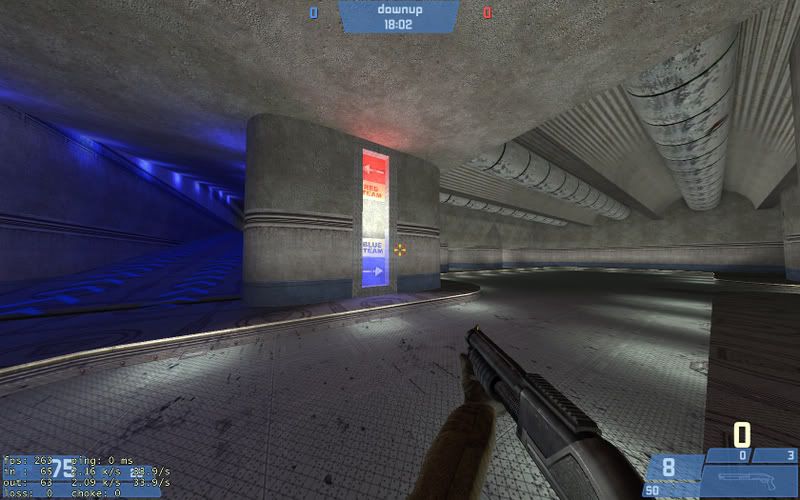 Off to the left is a aardvark-esque booster pad which gets you to the yard. You can go down that cooridor and jump over the pad. The blue lights give a voltron/runway type of feel when you boost off of it. Everything blurs and the lights look awesome. Here's right before you hit the pad. You may notice the glass where you boost. I'm going to be making that have an electric animation under the glass. The arrows are nice flavor IMHO. Thoughts on them though? 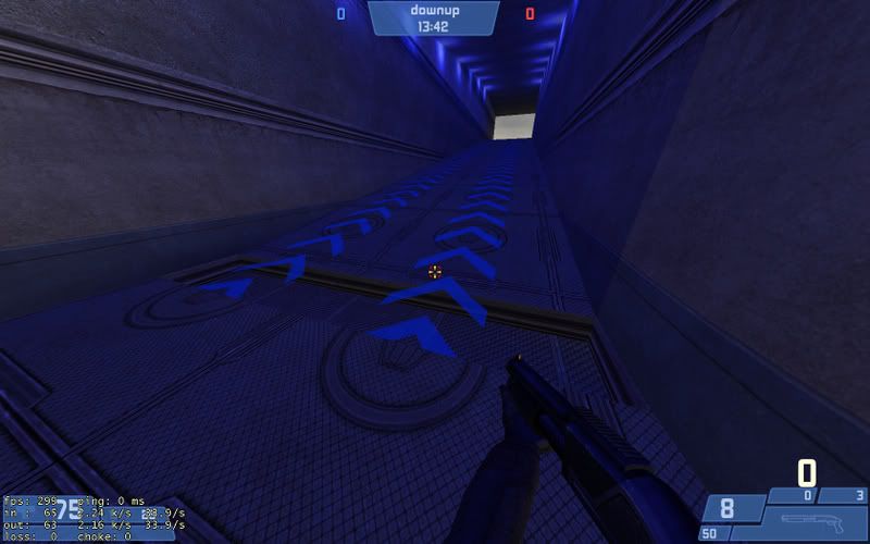 And then the boost, with speed on the right. You'll probably notice there isn't a blur in the screen. This is because it's gay. It totally blurs. I promise. 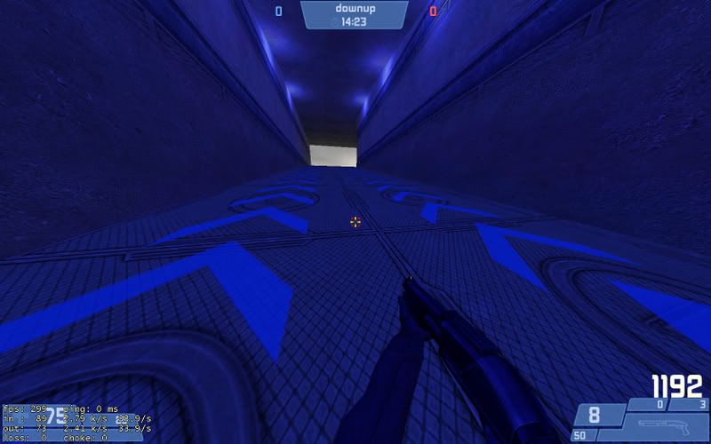 Anyway, all of that is what happens when you go left. Going right has this very unattractive room which needs stuff in it. Any ideas of what I should add? 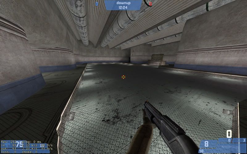
__________________
"The nine most terrifying words in the English language are: 'I'm from the government and I'm here to help.'" Ronald Reagan |
|
|

|
|
|
#2 |
|
Community Member
Server Owner
Beta Tester Forum Moderator Join Date: Mar 2007
Location: Hawthorne, California
Class/Position: Soldier/Spy/Scout Gametype: AvD Affiliations: :e0:Eternal Order Leader Posts Rated Helpful 12 Times
|
That looks pretty sweet
__________________
|
|
|

|
|
|
#3 |
|
D&A Member
Wiki Team Fortress Forever Staff Join Date: Apr 2007
Posts Rated Helpful 31 Times
|
Ease up on the colored light. It looks bad and makes it hard to tell teams apart. Your main illunination for an area should always be a fairly neutral light.
The arrows look good but change the material underneath. On the last room, you have some interesting stuff going on on the ceiling, but it's all washed out with light. Anything you can do to put some variation in the lighting would be good. If you lower the pipe-type things a bit, and/or add some more stuff, you could get some good shadows on the ceiling. I'd probably also take out some of the floor lights and then add in some spot lights shining down from above. This will create contrast between the dark ceiling and the floor, which needs to be bright for gameplay. Also if you can do something like have the walls lean in, or do anything other than go straight up, that adds interest. |
|
|

|
|
|
#4 |
|
FF Loremaster
Beta Tester
Join Date: Sep 2007
Posts Rated Helpful 4 Times
|
The colored light is there for the aardvark style push. Going up it with the boost looks very neat. It's not there for anything besides that, and there isn't a time where you'd need to differentiate players in that area. It's one way up for the most part. You can see it here in sweet frapsified 30fps in low quality on youtube!
http://www.youtube.com/watch?v=P9P_4EFsvLY If it's not done processing come back and watch it. I'm still very much working on the appearance as that's all I'm really focusing on with this map. If I could figure out how to make a smooth displacement that goes around those corners then I'd make more interesting walls and ceilings. I've tried a lot of stuff with no success. If you, or anyone else, know a way to do this then I'll be all ears. I'm looking for a dome-like feel with it, and the super-bland top like that was the only realistic alternative with those walls. Edit: Anyway, I made some changes to the ceiling of that room. light_spots are incredibly annoying to fiddle with.
__________________
"The nine most terrifying words in the English language are: 'I'm from the government and I'm here to help.'" Ronald Reagan Last edited by Credge; 11-14-2008 at 08:31 AM. |
|
|

|
|
|
#5 |
|
FF Loremaster
Beta Tester
Join Date: Sep 2007
Posts Rated Helpful 4 Times
|
Alright, I did some work on it a bit. I'm currently testing lights, so the room is a bit darker than what I want, but I like the effect on the ceiling. Also, it's much darker in image than in game. Didn't feel like adjusting the levels in photoshop.
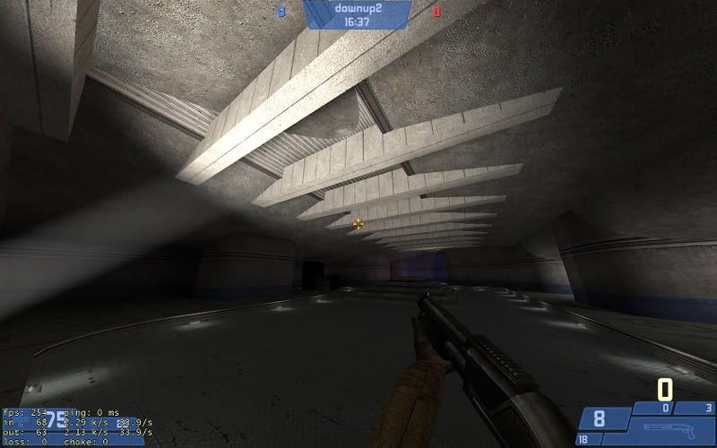 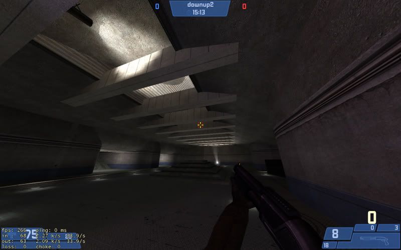 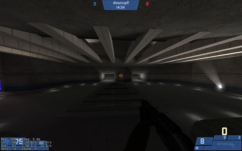 I decided to make this the place where you cap the flag. It fits the flow a bit and this room was a bit empty. The position of the capture point is liable to change. I'll also probably put a light shining down on it. Comments, thoughts, ideas?
__________________
"The nine most terrifying words in the English language are: 'I'm from the government and I'm here to help.'" Ronald Reagan |
|
|

|
|
|
#6 |
|
D&A Member
Wiki Team Fortress Forever Staff Join Date: Apr 2007
Posts Rated Helpful 31 Times
|
Now that's some mood lighting. Though it seems that all your lights are pure white. You can vary the lights even more by making them off-white. Incandescant lights are kind of yellow-orange, and flourescents are blue-green. You can use subtle colors to affect the mood of the player: warm colors are inviting, cool lights are kind of unsettling, and neutral white lights are sterile.
The pure blue light is still bad, imo. Try alternating the blue with white or using blue sprites. |
|
|

|
 |
| Currently Active Users Viewing This Thread: 1 (0 members and 1 guests) | |
|
|