
 03-28-2005, 12:36 PM
|
#341 |

Join Date: Jan 2005
Location: Arkansas
Posts Rated Helpful 0 Times
|
I love the ones |1.RD| Revelin done. Can you throw some Red, Blue, Green, and Yellow ones in there?
|

|

|
|
03-28-2005, 04:47 PM
|
#342 | ||

Join Date: Jan 2005
Location: Sweden
Posts Rated Helpful 0 Times
|
Quote:
|
||
|
|
|
|
03-28-2005, 04:49 PM
|
#343 | |
|
Join Date: Jan 2005
Location: Sweden
Posts Rated Helpful 0 Times
|
Quote:
btw sorry for the double post.. |
|
|
|
|
|
03-28-2005, 10:13 PM
|
#344 |
|
Join Date: Mar 2005
Posts Rated Helpful 0 Times
|
I dont like the way people keep using the old TFC backgrounds!
some of the logos are really cool tho. |
|
|
|
|
03-28-2005, 11:36 PM
|
#345 | |
|
Join Date: Mar 2005
Posts Rated Helpful 0 Times
|
Quote:
|
|
|
|
|
|
03-28-2005, 11:40 PM
|
#346 |
|
Join Date: Mar 2005
Posts Rated Helpful 0 Times
|
rough it up a litttle. colouring is too sharp/clean
|
|
|
|
|
03-29-2005, 02:28 AM
|
#347 |
|
Join Date: Jan 2005
Location: Pennsylvania
Posts Rated Helpful 0 Times
|
I could picture those as a flag sprite.
Come to think of it, I want to know what the new flags will look like.. hmmm |
|
|
|
|
03-29-2005, 04:24 AM
|
#348 | |
|
Join Date: Jan 2005
Location: FF website
Posts Rated Helpful 0 Times
|
Quote:
|
|
|
|
|
|
03-29-2005, 12:29 PM
|
#349 | ||
|
Join Date: Jan 2005
Location: Arkansas
Posts Rated Helpful 0 Times
|
Quote:
"I'm not worthy! I'm not worthy! I'm not worthy" I love Waynes World. |
||
|
|
|
|
03-30-2005, 01:13 AM
|
#350 |
|
Join Date: Mar 2005
Posts Rated Helpful 0 Times
|
who dosnt? And yes the ones |1.RD| Revelin are very nice, athough they are just solid and transparent. As others said blend and rough it up some more.
|
|
|
|
|
03-30-2005, 01:30 AM
|
#351 | |
|
Join Date: Feb 2005
Posts Rated Helpful 0 Times
|
Quote:
or something. |
|
|
|
|
|
03-30-2005, 01:41 AM
|
#352 | |
|
Join Date: Mar 2005
Location: Wisconsin, USA
Posts Rated Helpful 0 Times
|
Quote:
|
|
|
|
|
|
03-30-2005, 05:39 AM
|
#353 |

Join Date: Feb 2005
Location: Minnesota
Posts Rated Helpful 0 Times
|
The last one still reminds me of Mastercard.
|
|
|
|
|
03-30-2005, 01:42 PM
|
#354 |
|
Join Date: Jan 2005
Location: Arkansas
Posts Rated Helpful 0 Times
|
Or jello...
|
|
|
|
|
03-30-2005, 01:54 PM
|
#355 |

Join Date: Dec 2004
Location: SCOTLAND (above England)
Posts Rated Helpful 0 Times
|
Leave that logo alone :P It likes being jello! Or Jelly as we would call it
|
|
|
|
|
03-30-2005, 04:15 PM
|
#356 |

Join Date: Mar 2005
Location: LBKTX
Posts Rated Helpful 0 Times
|
Whose 'we'???
|
|
|
|
|
03-30-2005, 04:32 PM
|
#357 |

Join Date: Dec 2004
Location: Newcastle, UK
Posts Rated Helpful 0 Times
|
He is many as he is one. The all seeing, all hearing buddah :P
|
|
|
|
|
03-30-2005, 05:24 PM
|
#358 |

Join Date: Feb 2005
Location: A Small Box
Posts Rated Helpful 0 Times
|
Kinda like killer monkeys with lasers shooting out of thier noses
|
|
|
|
|
03-30-2005, 07:12 PM
|
#359 |
|
Join Date: Dec 2004
Location: Keller, TX
Posts Rated Helpful 0 Times
|
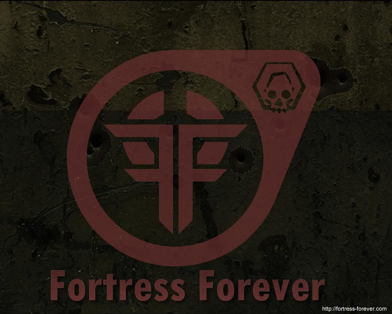
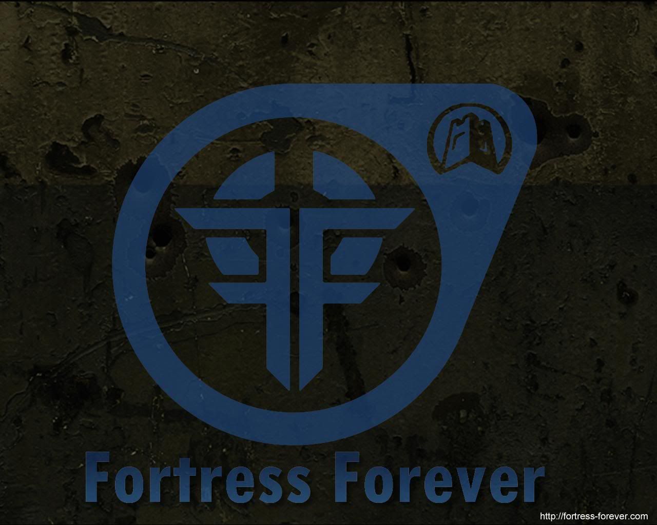
I dont personally like the infinity ones as much as the classic style (with double f instead of the T).
 that gets my vote (logo alone, w/o background) |
|
|
|
|
03-31-2005, 11:28 AM
|
#360 | |
|
Join Date: Feb 2005
Posts Rated Helpful 0 Times
|
Quote:
how's about something like this? (Clicky for biggy) |
|
|
|
|
 |
| Currently Active Users Viewing This Thread: 1 (0 members and 1 guests) | |
|
|


 Linear Mode

